
Set up the Home screen, starter card and forms
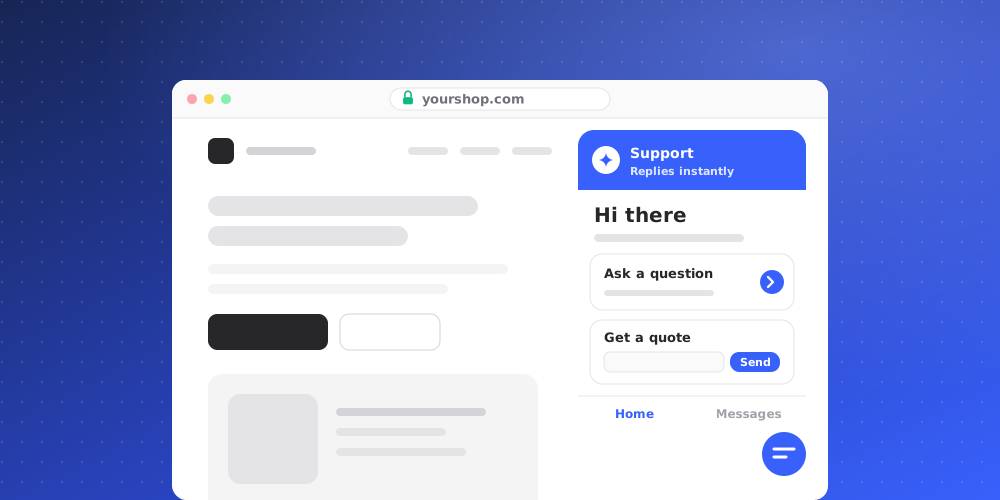
Besides the chat itself, the widget can greet visitors with a Home screen, offer quick replies, and collect details through forms. Everything you submit through these ends up in your inbox.
The Home tab
Open Studio > Chat Widget > Home. Turn on Show the Home tab to give the widget a start screen. With it off, visitors go straight to the chat.
- Show Help Center tab shows your published Help Center articles inside the widget.
- Header color sits behind the greeting with white text on it, so pick a deep color. By default it follows your accent color.
- Logo: a wordmark on a transparent background works best. Without one, the display name shows.
- Show team pictures shows your team's avatars.
- Greeting: use
{name}to insert the visitor's first name when your site tells the widget who they are. Greeting for anonymous visitors is used otherwise, and Second line sits underneath.
Blocks
Click Add block to add content below the greeting. You can add up to 12 blocks and reorder them. The block types are:
- Start a conversation
- Links
- Promotion, for example an offer with an optional discount code and start and end dates
- Trust, for stats, awards and review platforms
- Announcement, with an Info, Success or Warning style
- Last conversation, which lets a returning visitor pick up their open conversation
Blocks can be limited to Desktop only or Mobile only with Show on.
Starter card: quick replies and a contact form
The starter card sits inside the greeting. Open Studio > Chat Widget > Conversation and turn on Starter card.
- Quick replies: up to 4, one per line. Each one sends its text as the visitor's message.
- Contact form: turn it on to offer a lead form. Set the Button label, Form title, Description, Submit label and Thank-you message, and choose whether to Ask for a message.
A form submission arrives in your inbox as the visitor's message, with their name and email on the contact. The starter card is saved with the rest of the widget settings and goes live when you deploy.
Stored cards and forms
For more control, open the Widgets page from the Overview tiles in Studio. Here you create cards and forms that are stored separately and shown in the widget's greeting.
- Click New card to create a card with up to 3 buttons. A button can Send a reply, Open a link or Open a form.
- Click New form to build a form with up to 10 fields. Field types are Short text, Name, Email, Phone, Long text, Number, Choice and Checkbox, and each can be marked required.
- A form can run an AI Action on submit, using an action you created on the Actions page.
New cards and forms start switched off. Turn one on to show it in the widget; visitors see changes within about a minute. Under Recent submissions you can see what visitors sent, newest first, and how a linked action went. Each submission is also a message in its conversation. Owners, admins and managers can create and change cards and forms.